


Graph 2
Include another six hundred years of temperature data and suddenly that "alarming rise" doesn't look like much.
The NOAA data shows the Medieval Warm Period which Michael Mann's infamous Hockey Stick graph somehow
erased. Unfortunately for IPCC climate cultists, historical records verify the warming and the Climategate scandal
exposed Mann's data manipulation. So was the MWP an aberration? Graph 3 adds more perspective.


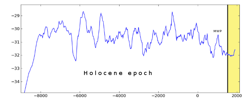

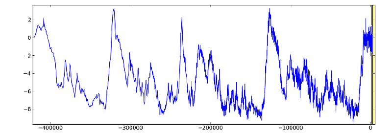
Commentary & shading mine - data plotting courtesy of J. Storrs Hall.